library(tidycensus)
library(tidyverse)
library(tigris)
library(patchwork)
library(sf)
options(tigris_use_cache = TRUE)Motivation
This article will explore some interesting aspects of New Mexico’s racial demographics using R and the TidyCensus package. The US Census Bureau makes an amazing amount of data available to the public on https://census.gov. The site allows you to easily search for and download demographic information with myriad variables and geographic subsets. The site also provides an API for programmatic access, and R is fortunate to have the TidyCensus package to easily grab data of interest to the programmer.
New Mexico has relatively large Native American and Hispanic populations. Nearly half of New Mexico residents are Hispanic, compared to a national average of around 20% (we’ll calculate it later). The profile of Latinos in New Mexico, however, is very different from the rest of the country, as we shall see.
Not only is the Hispanic population of New Mexico uniquely large in percentage terms, it is also unusual in terms of national identity of the Hispanics. Unlike Latinos in most of the rest of the country, many Hispanics in New Mexico do not identify at all with Latin America, but directly with their European ancestry.
The rest of this article will explore the Hispanic population in New Mexico and the historical context which explains this particular situation. Along the way, I will show how to use the R package tidycensus to access the wealth of data on https://census.gov.
A little history
New Mexico has the oldest state capital in the United States, Santa Fe having been founded 10 years before Boston. While the British were exploring from the coast, the Spaniards were moving upwards from what was to be Mexico into the territory that would become New Mexico.
Mexico won independence from Spain in 1821, and that included New Mexico. While the Spanish residents gave nominal allegiance to Mexico, it was never very enthusiastic. After the Treaty of Hidalgo, in which the territory of New Mexico was ceded to the United States, Hispanics quickly dropped any pro-Mexican sentiment, they might have had and were anxious to assert their identity as Americans with roots in Europe, not Latin America. This group is called nuevomexicanos by many, but in New Mexico they are called Hispanos.
Immigrants in New Mexico
Getting ACS data
Before looking at Latinos specifically, I would like to take a quick look at immigration to New Mexico, since many Hispanics are immigrants. Using get_acs() I can get data from the American Community Survey 5-year tables. The most time-consuming part is sifting through the thousands of variables to find the ones you want. Fortunately, tidycensus provides a function to download the variables, which can then be Viewed and searched.
v23 <- load_variables(2023, "acs5", cache = TRUE)
View(v23)
pob_vars = c(
Native = "B05002_002",
ForeignBorn = "B05002_013"
)Now I can use get_acs() to download the data. There are many possibilities for geography, which is required. Some are obvious like “us”, “state” and “county”. I specify which state I want. The summary_var argument adds an additional column to the data frame containing totals, allowing for easy calculations of percentages.
get_acs() has an optional argument which can be passed, geometry = TRUE. This handy method adds geometries from tigris and returns the sf object necessary for cartographic plotting. Unfortunately, I get errors using this for county and state data, so I need to manually perform the process.
First, I’ll grab shapes for the states and for the counties in New Mexico. The shift_geometry() function will put Alaska and Hawaii in a convenient place on the maps. GEOID is standard across all datasets, and encodes the state, county, and census tract, depending on the level of data requested. There are many columns in the tigris datasets, but I only want the name and geometry.
library(tigris)
states <- states() |>
  select(GEOID, state = NAME, geometry) |>
  shift_geometry()
Retrieving data for the year 2021nm_counties <- counties("NM") |>
select(GEOID, county = NAME, geometry)Retrieving data for the year 2022Now, with standard dplyr syntax, I can create the sf data frame. I want to do comparisons to the US in general, so I will also get data for all 50 states. left_join allows me to add the geometry from nm_counties based on the invaluable GEOID. Once joined, though, I no longer need it, nor a number of other columns, so I select the ones I want.
immigration_23 <- get_acs(
  geography = "county",
  state = "NM",
  variables = pob_vars,
  summary_var = "B05002_001",
  year = 2023,
  cache_table = TRUE,
) |>
  left_join(nm_counties,  by = "GEOID") |>
  select(variable, estimate, moe,
         county, summary_est, geometry) |>
  st_as_sf()
Getting data from the 2019-2023 5-year ACSPercentages can be more interesting than raw numbers, so I will calculate them. R makes it so easy to create new columns based on existing ones.
immigration_23$pct_foreign = immigration_23$estimate / immigration_23$summary_est
immigration_us$pct_foreign = immigration_us$estimate / immigration_us$summary_est
Now we can see some basic stats:
pct_fb_nm <- with(
  immigration_23,
  mean(pct_foreign[variable == "ForeignBorn"]))
pct_fb_us <- with(
  immigration_us,
  mean(pct_foreign[variable == "ForeignBorn"]))
data.frame(
  Area = c("New Mexico", "US"),
  Average = c(pct_fb_nm, pct_fb_us)
)
Area Average
1 New Mexico 0.06774040
2 US 0.09565981Despite having a the largest Hispanic population in the country, New Mexico has a much smaller percentage of immigrants than the overall average.
Visualizing the data
I would like to visualize this data. Explaining ggplot is beyond the scope of this article, unfortunately. I highly recommend the R Graphics Cookbook. I use the + operator from the patchwork library to put the plots side by side.
p1 <- ggplot(immigration_23,
             aes(x = variable, y = estimate)) +
  geom_col(fill = "navy") +
  labs(x = element_blank(),
       y = "Population",
       fill = "County",
       title = "New Mexico") +
  scale_y_continuous(labels = scales::comma) +
  theme_bw()

p2 <- ggplot(immigration_us, aes(x = variable, y = estimate)) +
  geom_col(fill = "navy") +
  labs(x = element_blank(),
       y = "Population",
       title = "US",
       caption = "acs5 2023") +
  scale_y_continuous(labels = scales::comma) +
  labs(y = element_blank(),
       caption = "Source: census.gov acs5 2023") +
  theme_bw()

p1 + p2
We can see on a map where the largest concentration of immigrant groups are.
immigration_us$percent <- immigration_us$estimate / immigration_us$summary_est

immigration_us |>
  filter(variable == "ForeignBorn") |>
  ggplot(aes(fill = percent)) +
  geom_sf(aes(geometry = geometry)) +
  scale_fill_viridis_c(labels = scales::percent) +
  labs(title = "Immigrant population by state",
       caption = "Source: census.gov acs5 2023") +
  theme_void() +
  theme(plot.margin = margin(.3,.3,.3,.3, "cm"))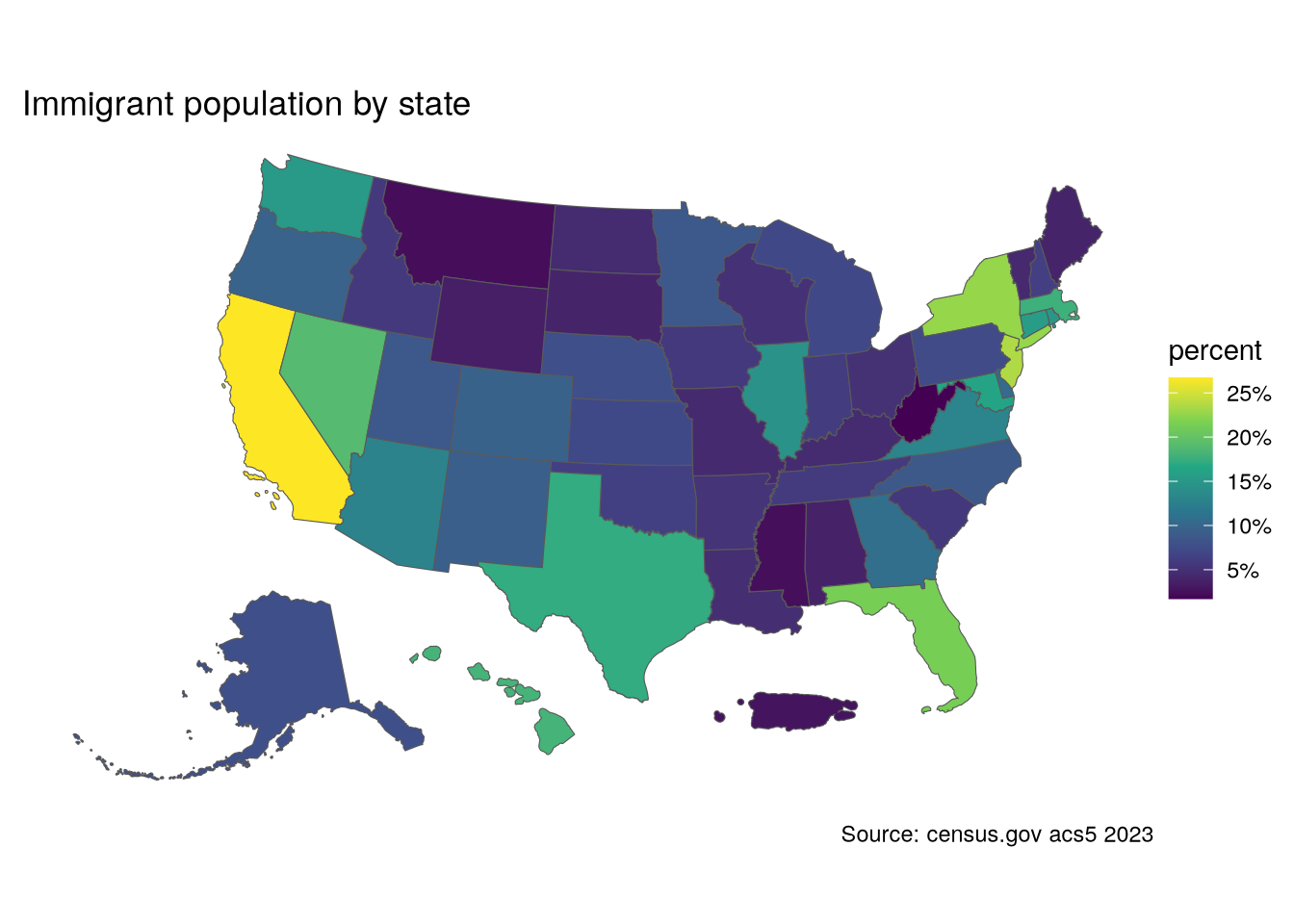
I’d like to put some cities on the New Mexico map for orientation purposes. As of this writing, I am unable to use the standard tigris::places("NM", year = 23) command, as it says that the data is unavailable. So I needed to download the file from https://www2.census.gov/geo/tiger/TIGER2023/PLACE/. I’ll extract a few cities in different parts of the state. The shapefiles are POLYGONs, but I need a single point, so I’ll use st_centroid().
places <- read_sf("data/places/tl_2023_35_place.shp")
cities <- c("Albuquerque", "Santa Fe",
            "Las Cruces", "Raton", "Roswell",
            "Gallup", "Santa Rosa", "Farmington")
city_pts <- places |>
  filter(NAME %in% cities) |>
  select(City = NAME, geometry) |>
  st_as_sf() |>
  st_centroid()
fb <- immigration_23 |>
filter(variable == "ForeignBorn")
ggplot() +
geom_sf(data = fb, aes(fill = pct_foreign)) +
geom_sf(data = city_pts, size = .5, color = "red") +
geom_sf_text(data = city_pts, aes(label = City),
size = 3, color = "gold",
vjust = "top",hjust = "left",
nudge_y = -.1) +
scale_fill_viridis_c(labels = scales::percent) +
labs(title = "NM Immigrant population by county",
caption = "Source: census.gov acs5 2023",
fill = "percent") +
theme_void() +
theme(plot.margin = margin(.3,.3,.3,.3, "cm"))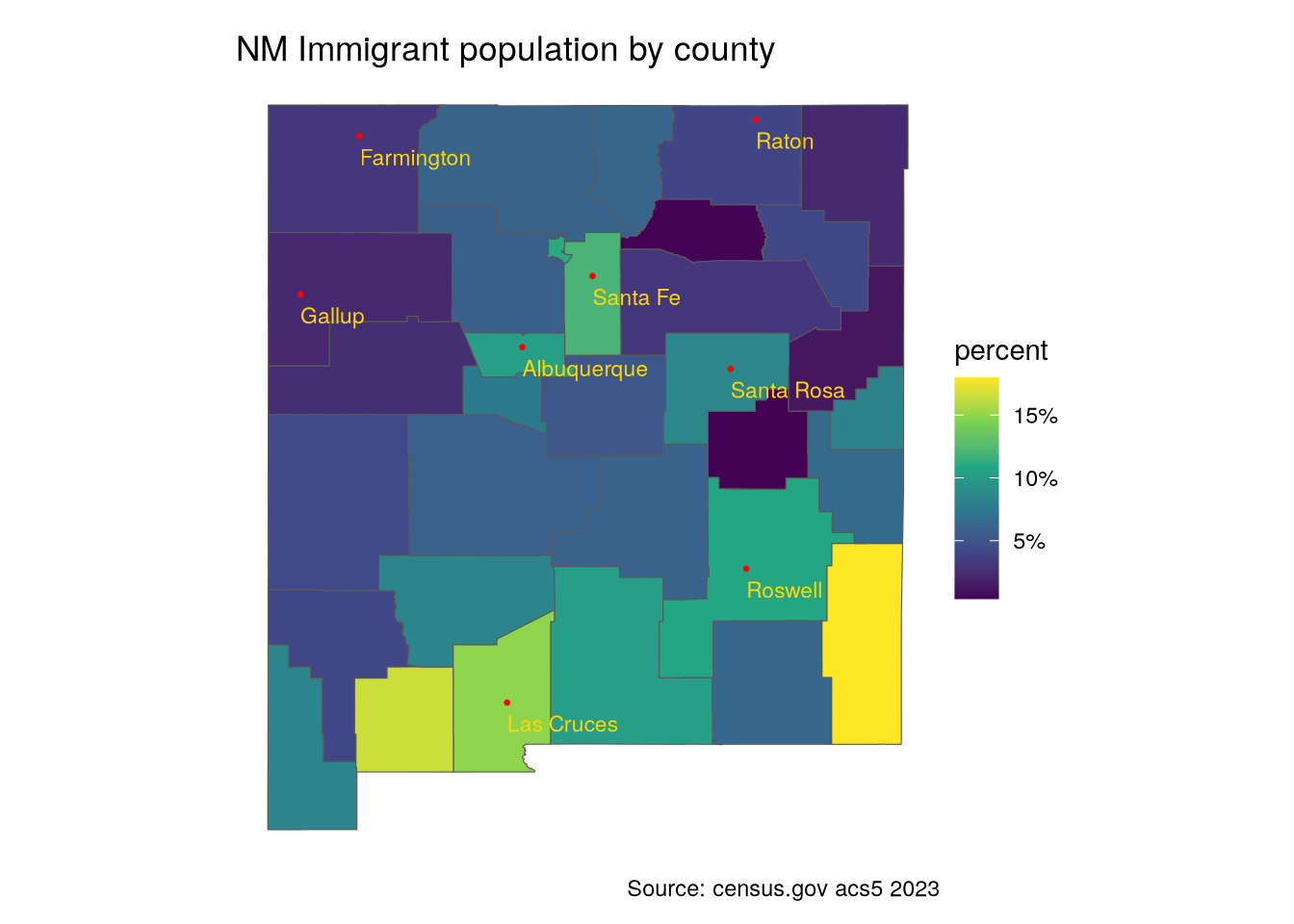
Not surprisingly, the highest percentage of immigrants is near the Mexican border.
Origins of immigrants
Since we are concerned with Hispanics, it is useful to have an idea about immigration from Latin America, and Mexico in particular given that NM is a border state. I will get the data associated with the birth place of foreign residents.
foreign_origin_nm <- get_acs(
  geography = "county",
  state = "NM",
  variables = orig_vars_23,
  summary_var = "B05006_001",
  year = 2023,
  cache_table = TRUE
) |>
  left_join(nm_counties, by = "GEOID") |>
  select(variable, estimate, moe,
            county, total = summary_est,
            geometry) |>
  st_as_sf()
Getting data from the 2019-2023 5-year ACSp1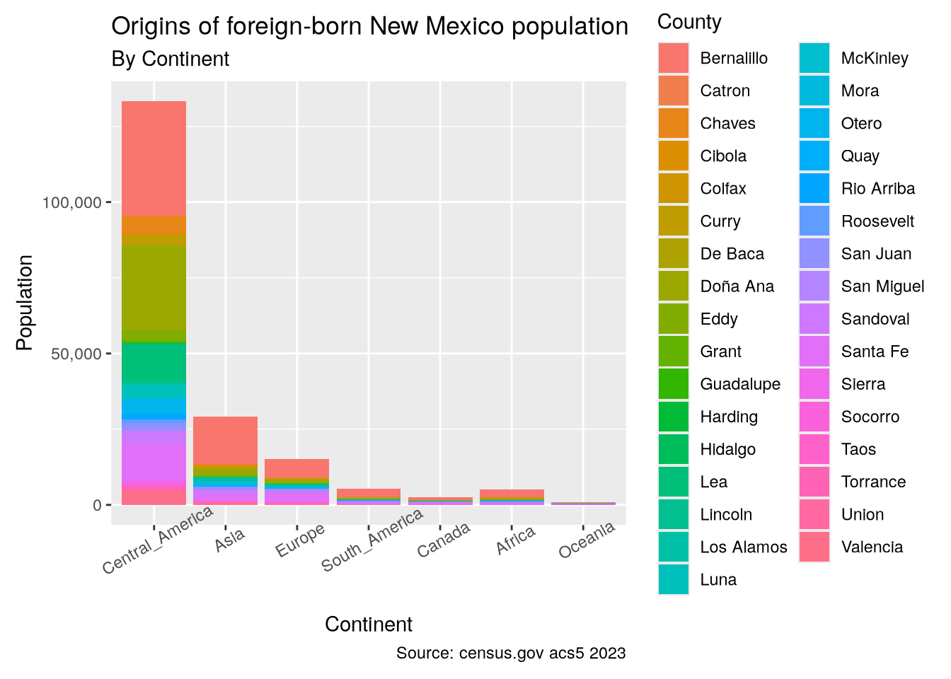
The largest group of immigrants is from Central America, which includes Mexico in these tables. Zooming in on the eight most populated counties is interesting, showing a sizable number of Asian immigrants, especially around Albuquerque (Bernalillo County).
counties_top_8 <- foreign_origin_nm |>
  group_by(county) |>
  summarise(est_sum = sum(estimate)) |>
  slice_max(order_by = est_sum, n = 8) |>
  ungroup()
foreign_origin_nm |>
filter(variable %in% continents & county %in% counties_top_8$county) |>
mutate(county = fct_reorder(county, desc(total))) |>
ggplot(aes(x = county, y = estimate, fill = variable)) +
geom_col() +
labs(x = "County",
y = "Population",
fill = "Continent",
title = "Origins of foreign-born New Mexico population",
subtitle = "Top 10 Counties by Population",
caption = "Source: census.gov acs5 2023") +
scale_y_continuous(labels = scales::comma) +
scale_fill_viridis_d(labels = c("Africa", "Asia", "Canada", "Central America",
"Europe", "Oceania", "South America")) +
theme_gray() +
theme(axis.text.x = element_text(angle = 30))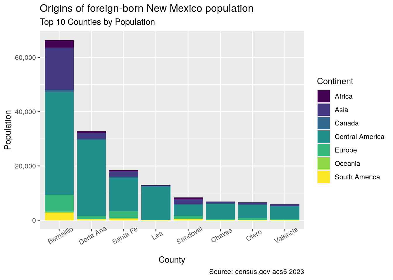
Hispanics
Let’s look at where most Latinos live in the country.
p1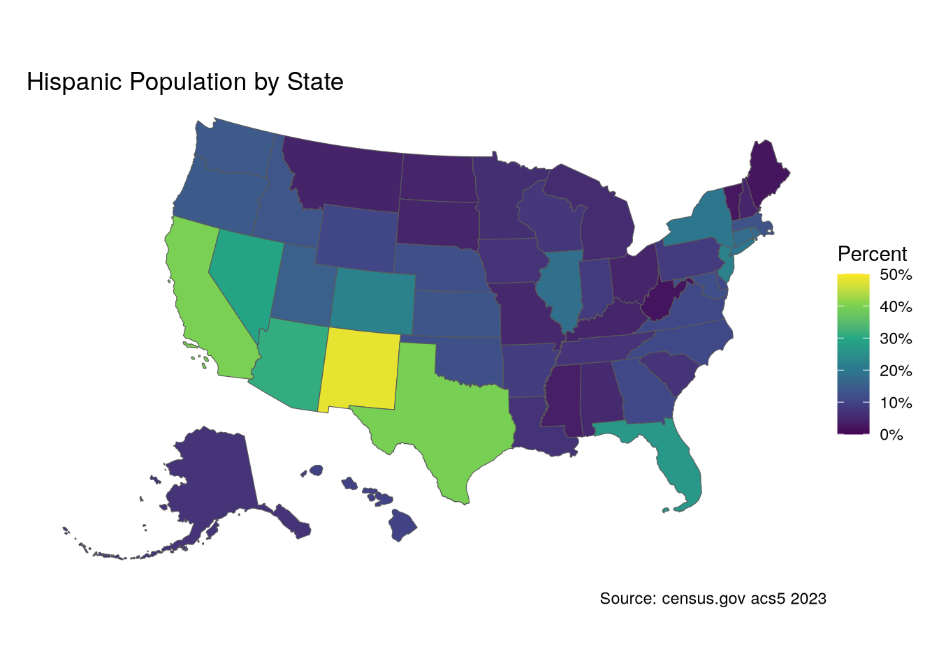
How about the top 5 states by total Latinos? Not surprisingly, the largest states have the largest population of Hispanics, and New Mexico doesn’t even make the list.
us_hisp_pct |>
  st_drop_geometry() |>
  slice_max(order_by = Hispanic, n = 8) |>
  select(State, Hispanic)
# A tibble: 8 × 2
State Hispanic
<chr> <dbl>
1 California 15630830
2 Texas 11697134
3 Florida 5865737
4 New York 3898652
5 Puerto Rico 3215824
6 Illinois 2348118
7 Arizona 2255770
8 New Jersey 2032968On the other hand, looking by percentage tells a different story:
us_hisp_pct |>
  st_drop_geometry() |>
  slice_max(order_by = Hispanic_Pct, n = 8) |>
  select(State, Hispanic_Pct)
# A tibble: 8 × 2
State Hispanic_Pct
<chr> <dbl>
1 Puerto Rico 0.988
2 New Mexico 0.482
3 California 0.398
4 Texas 0.395
5 Arizona 0.310
6 Nevada 0.292
7 Florida 0.267
8 Colorado 0.222As you can see, New Mexico is the state with the highest proportion of Latinos, nearly half, and almost 10% higher than the next highest states.
We can see how Latinos are spread across New Mexico. For easy plotting, I will make columns from the two variables using pivot_wider() and add a column with percentages.
nm_hisp_pct <- get_acs(
  geography = "county",
  state = "NM",
  variables = c("B03001_002", "B03001_003"),
  summary_var = "B03001_001",
  year = 2023,
  cache_table = TRUE) |>
  left_join(nm_counties,
            by = "GEOID") |>
  select(-moe, -summary_moe) |>
  pivot_wider(names_from = variable, values_from = estimate) |>
  rename(County = "NAME", Total = "summary_est",
         Non_Hispanic = "B03001_002", Hispanic = "B03001_003") |>
  mutate(Hispanic_Pct = Hispanic / Total) |>
  st_as_sf()
Getting data from the 2019-2023 5-year ACSp1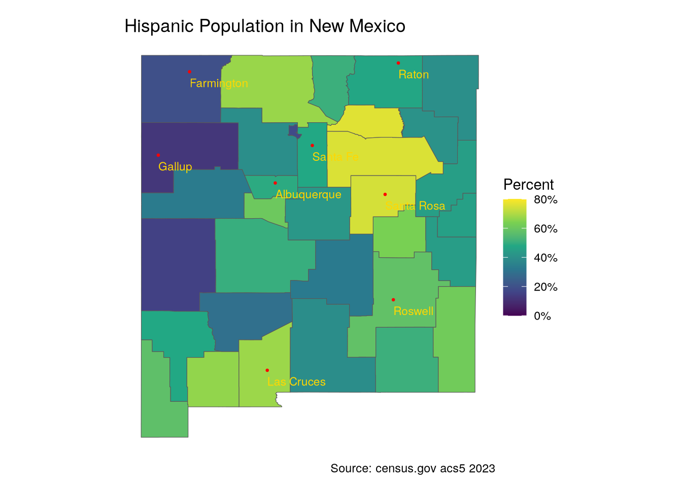
The highest concentrations are not along the border, but in the Northern counties. These are the counties with the largest percentage of Hispanics, followed by the percentages in New Mexico’s most populated counties.
nm_hisp_pct |>
  slice_max(order_by = Hispanic_Pct, n = 8) |>
  st_drop_geometry() |>
  select(county, Hispanic_Pct)
# A tibble: 8 × 2
county Hispanic_Pct
<chr> <dbl>
1 Mora 0.761
2 San Miguel 0.753
3 Guadalupe 0.745
4 Doña Ana 0.676
5 Rio Arriba 0.673
6 Luna 0.665
7 De Baca 0.635
8 Lea 0.616nm_hisp_pct |>
filter(county %in% counties_top_8$county) |>
st_drop_geometry() |>
select(county, Hispanic_Pct)# A tibble: 8 × 2
county Hispanic_Pct
<chr> <dbl>
1 Bernalillo 0.489
2 Chaves 0.579
3 Doña Ana 0.676
4 Lea 0.616
5 Otero 0.391
6 Sandoval 0.395
7 Santa Fe 0.480
8 Valencia 0.606Hispanic origins
Now let’s look at the national origins of Latinos in New Mexico.
First, here are the proportions of Hispanic to Non-Hispanic in the biggest counties.
p1
And then the national identities from the same counties.
p1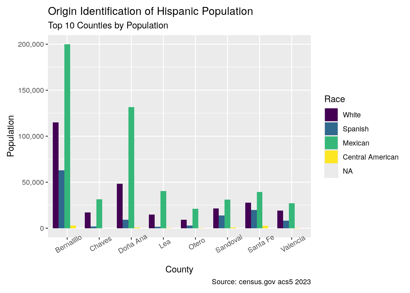
Most Hispanics clearly identify with Mexico, as is true nationally, and White implies European, and therefore Spanish, heritage.
p1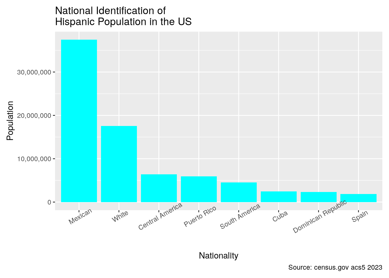
Before moving on, I want to highlight the code that produced this dataset, as it demonstrates how easily obtaining and wrangling data can be done with a chained workflow in R thanks to the pipe (|>). In this case, I want to combine the values of three variables into one. The data downloaded has three variables for Hispanics of Spanish descent (Spanish, Spaniard and Spanish American), which I want to combine into a single value. In this code, I pivot_wider to have the variables in columns. Then I sum the three columns to create a new column, drop the now unneeded ones, and pivot back to the long form which ggplot likes. I further calculate percents, and then add geometries for mapping, select only the columns I need, and creating an sf object.
All of that with one command! (Well, a long one.)
```{r}
hispanic_us <- get_acs(
  geography = "state",
  variables = hisp_vars,
  summary_var = "B03001_001",
  year = 2023,
  cache_table = TRUE) |>
  rename(state = NAME) |>
  pivot_wider(names_from = variable, values_from = estimate) |>
  rowwise() |>
  mutate(Hispanic_Spain = sum(c_across(Hispanic_Spaniard:Hispanic_Spanish_American), na.rm = TRUE)) |>
  select(-c("Hispanic_Spaniard", "Hispanic_Spanish", "Hispanic_Spanish_American")) |>
  pivot_longer(cols = Non_Hispanic:Hispanic_Spain, names_to = "variable", values_to = "estimate", values_drop_na = T)|>
  group_by(state, variable) |>
  mutate(pop = sum(estimate)) |>
  distinct(variable, .keep_all = TRUE) |>
  mutate(percent = pop / summary_est) |>
  left_join(states, by = "GEOID") |>
  select(variable, pop, summary_est,
         state = state.y, geometry) |>
  st_as_sf()
```New Mexico has the highest proportion of Hispanics who identify as white after Puerto Rico.
p1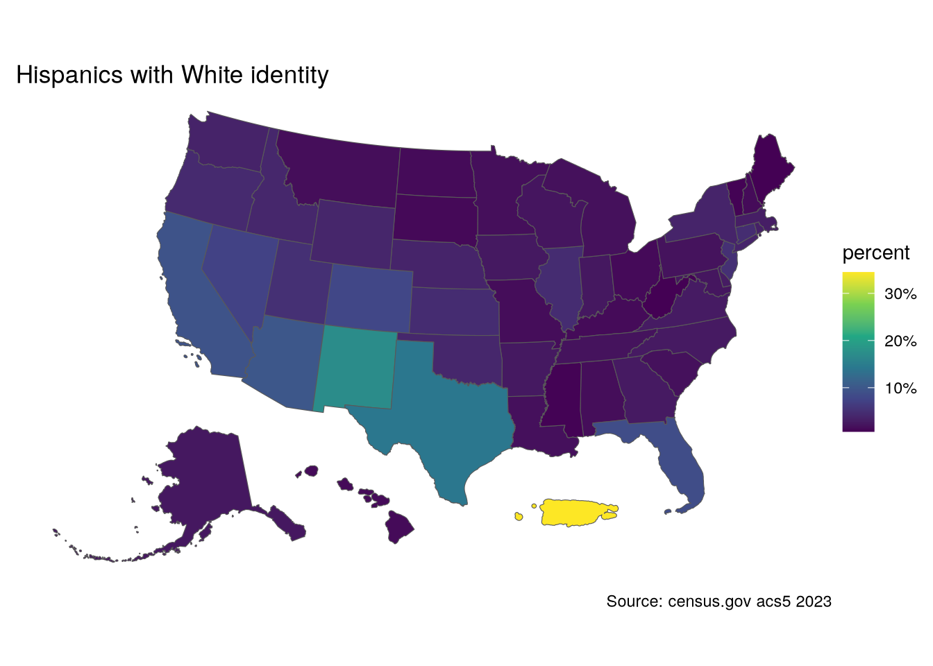
Now let’s see how the various groups of Hispanics are distributed in the state. First, for all Hispanics:
hispanic_nm$percent <- hispanic_nm$pop / hispanic_nm$summary_est
Code
hisp <- hispanic_nm |> filter(variable == "Hispanic")
p1 <- ggplot() +
  geom_sf(data = hisp, aes(fill = percent)) +
  geom_sf(data = city_pts, size = .5, color = "red") +
  geom_sf_text(data = city_pts, aes(label = City),
               size = 3, color = "gold",
               vjust = "top",hjust = "left",
               nudge_y = -.1) +
  labs(title = "Hispanic Population in New Mexico",
       fill = "Percent") +
  scale_fill_viridis_c(labels = scales::percent) +
  theme_void()
p2 <- ggplot() +
  geom_sf(data = hisp, aes(fill = pop)) +
  geom_sf(data = city_pts, size = .5, color = "red") +
  geom_sf_text(data = city_pts, aes(label = City),
               size = 3, color = "gold",
               vjust = "top",hjust = "left",
               nudge_y = -.1) +
  labs(fill = "Population",
       caption = "Source: census.gov acs5 2023") +
  scale_fill_viridis_c(labels = scales::comma) +
  theme_void()

p1 + p2
Warning in st_point_on_surface.sfc(sf::st_zm(x)): st_point_on_surface may not
give correct results for longitude/latitude data
Warning in st_point_on_surface.sfc(sf::st_zm(x)): st_point_on_surface may not
give correct results for longitude/latitude data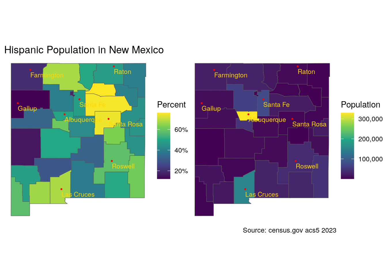
p1 + p2
Now let’s look at where Spanish Hispanics live in the state. In the second set of maps, I combine the Spanish and White Hispanic populations.
(p1 + p2) / (p3 + p4)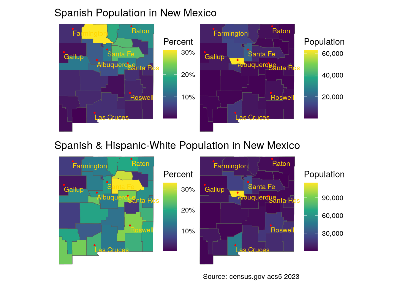
The Hispanos are clearly concentrated in the north-eastern part of the state. Let’s see about the Mexican Hispanics.
p1 + p2
The Mexican Hispanics are concentrated in the southern part of the state. It is clear from the maps that these two groups, Spanish and Mexican, are largely distinct geographically. In all cases, unsurprisingly, the largest number of people in each group live in the primary urban center of the state.
Next steps
In Bernalillo County, home of Albuquerque, the largest city by far in New Mexico, there are large numbers of all ethnicities represented in the state. It will be interesting to drill down on the county to see whether the geographic separation persists in an urban setting. Additionally, spatial modeling could be used to verify that the apparent geographic separation between the two groups is not random. Such an analysis would probably be more interesting in the context of the urban melting pot of Albuquerque. Thirdly, a time series analysis regarding the increase or decrease in the Mexican population to understand how the situation is evolving. Finally, correlation of the geographic distribution with statistics such as income, housing value, or the GINI statistic could be elucidating.
This notebook with all the code is available in my GitHub repository. Happy coding. And if you have pointers to improve my code, I would be grateful for comments. Happy coding!